The new Tarawi Shirt has happily joined my wardrobe!
Here’s a little bit of wardrobe and colour-scheme exploration about fitting these new Tarawi Shirts into my wardrobe!


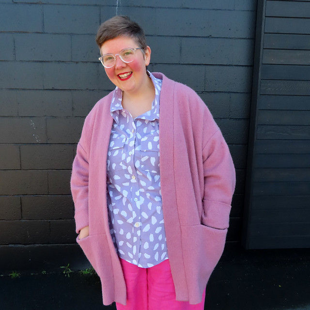
Above left, I’m wearing my navy Shoalhaven Shacket with a brushed cotton twill Tarawi Shirt, natural linen Glebe Pants and my McLean & Co scarf. Above right, I’m wearing my pink boiled wool Belmore Jacket, purple cow print Tarawi, and hot pink Glebe Pants.
I’ve posted before about my explorations trying to narrow down a colour scheme for my wardrobe, or ‘trying to make sure every project is a winner’. With still no solid answers (but ever more questions), these 2 shirts raised a lot of questions for me.
The two Tarawi Shirts that I’ve shared here were fabrics I had decided wouldn’t necessarily be for me, or not for me to wear out in public! The purple ‘cow spot’ fabric I had put aside to sell at a stash sale (but nobody bought it from me) and I got the blue plaid thinking I might make a shirt for someone else, or pyjamas for myself… Basically, these were toiles that I think have redeemed themselves (and given me food for thought) because I wasn’t sure they’d be winners colour-wise for me!

Because I love all fabrics and really bright colours (would you believe that I’m a bit obsessed with bright Kaffe Fassett prints?), it can be difficult for me to narrow down things that I’m quite drawn to, but don’t necessarily want to wear. The purple ‘cow print’ fabric arrived in the post, and I thought ‘why did you buy that?’. I was pretty certain that I’d fallen prey to that classic ‘love it but don’t want to wear it’ situation.
The pale lilac shade and the print both felt very ‘young’. Like something a Gen X would wear with mint mules. Fine for them, but not something for me necessarily.
Something obviously made me hold on to the fabric, and I’m quite taken by the final product! I like how there’s a pattern, but it’s still quite low-contrast, and how the purple shade will work with many of the other colours in my wardrobe.

Navy has been a colour that I’ve been avoiding lately. Not because I don’t like it, and not because it doesn’t suit me, but because I found that it was bringing a lot of contrast to my outfits- contrast that I didn’t feel good in (read more musings from me on low-contrast combos). This discovery came after I finished this Shoalhaven (a project I was really pleased with), and then found I really wasn’t reaching for because it was too high-contrast and wasn’t bringing me joy.
The cozy navy brushed cotton twill I used for this Tarawi was fabric that I’d decided to use as a toile- I didn’t expect to finish it into a wearable garment. The fabric was so snuggly and nice, that I did end up finishing it and it ended up being a great match for the Shoalhaven. Together, they make a pairing that I’m comfortable in.
I’ve paired the shirt and shacket combo with these rust Woden shoes that I was having a hard time pairing until @naomi.joy.creates pointed out that if I had leather shoes this shade I’d consider them a neutral. I imagine with some kind of denim pants, this would be the ultimate combo to make navy feel not-so-high-contrast!
So both of these shirts were from fabric which I had decided ‘probably weren’t for me’. I thought they’d struggle to fit into my current wardrobe, and that I wouldn’t necessarily get much joy from wearing them, or a lot of use from them. I’ve been absolutely proven wrong, and the colours have raised quite a few questions (like, do I need some warm blue linen pants?)!

Now you’ve gotten me seriously fantasizing about mint mules 😂..
LikeLike