Hello, Hello. It’s been a while between wardrobe planning posts, but it definitely hasn’t been a while between me thinking a lot about my wardrobe! In this post I’m going to talk about contrast, specifically from my face, and how that plays out in my wardrobe.
Maybe you’re on TikTok? Even if you’re not I think you can still watch this short video that I made.
How to tell your contrast?
The easiest way to work out your contrast level is to take a makeup-less photo of yourself in natural lighting which reflects your actual colouring and then use your phone/photo editing software to desaturate the photo. Using black & white filters will usually amp up the contrast setting when they apply the B&W filter, so just be careful that you’re just removing the colour.


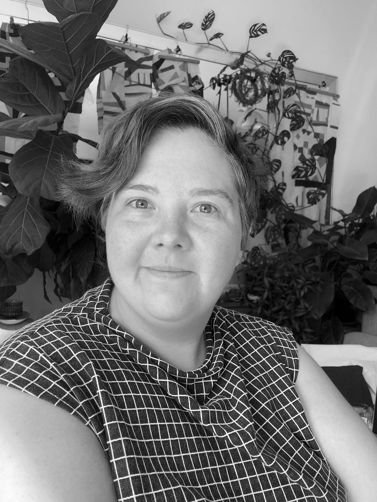
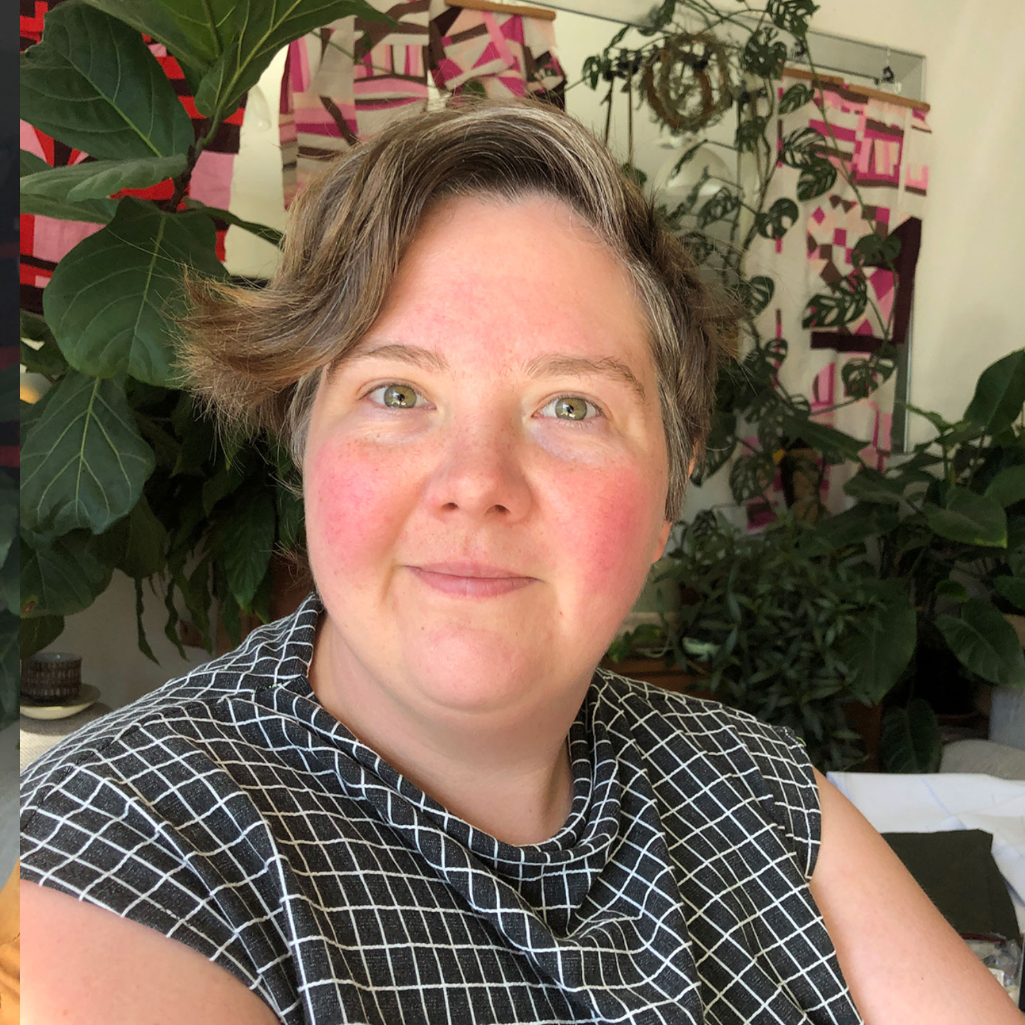
Here are 2 photos of me looking a bit creepy and dazed. Even though I have bright red cheeks from my rosacea, you can swipe to see that in b&w I have medium-low contrast, my eyebrows practically blend into my face, the whites of my eyes aren’t much lighter than my face. I can see also in the bottom image that as my grey hairs grow in, I’m definitely going to fall into the low-contrast category as the light grey hair is very similar to my skin.
Some garment fails
I suppose the next thing to do is to show you 4 garments that don’t get much wear/are ongoing regrets from my sewing (I’m looking at you Shacket). The Torrens Box Top on the left is a relatively recent make, which I thought was going to be a real wardrobe winner- so it just goes to show how being armed with all my previous musings hasn’t entirely stopped flops!

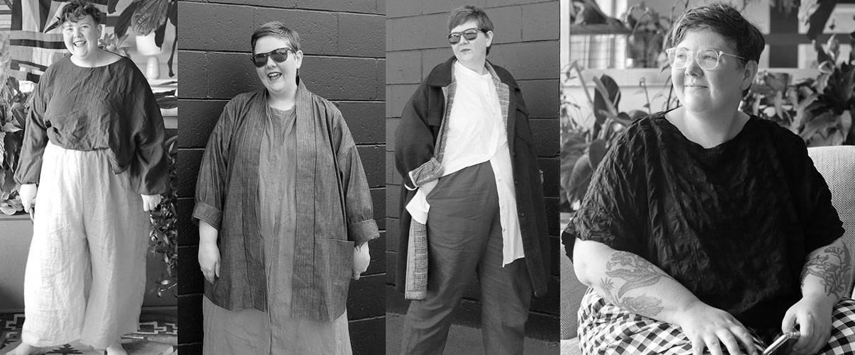
What do all these tops and outerwear makes that I’ve deemed flops have in common? They all contrast my low-contrast face A LOT.
Here might be a good time to include some links to other folks who have more to say about this topic before I crack on with quoting some of them and showing you more comparison pictures!
You might like to read these
- Simplified Wardrobe blog on contrast
- Contrast and depth from Crafting a Rainbow
- StyleMakeover on personal colours and contrast
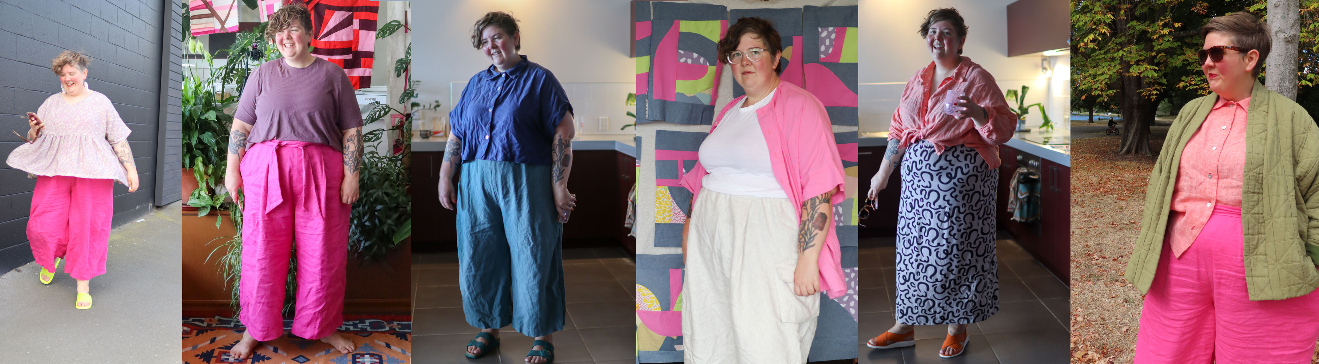

Here are some outfits that I do like, and it was interesting to me that even though I’ve written about low-contrasting colour combos, I generally thought of that as being monochromatic or analogous colour combos (so pairing similar colours together), rather than pairing tonally similar colours together. You can see above that some of the combos which have quite different colours paired together, are quite low-contrast in black & white.
But, you’re a warm autumn!

The image to the left is a picture from Chromology UK (who offer colour analysis for individuals).
She’s also a warm autumn, but she’s a warm autumn with a lot more contrast between her features, thanks to her dark hair and dark eyes.
It makes sense to me in hindsight that we wouldn’t necessarily gravitate to the same warm autumn colours.
If you want to read more from me about colour-schemes and wardrobe-planning, check out all of those posts here.
Do I need to embrace my contrast?
It’s absolutely not necessary for me to embrace my low-contrast face and sew by it. Gillian from Crafting a Rainbow mentions in her post about contrast that although she’s low-contrast she enjoys using makeup to create contrast for herself. So, you can absolutely play with makeup/dyeing your hair to play with your contrast levels.
I would rather lean in to dressing my natural face than wearing makeup because:
- I actively don’t want to create a high-femme look
- I feel that sometimes covering my rosacea might lead me to feel worse about my skin in the long run
- My skin is so sensitive that I can’t wear mascara, eyeliner, oil-based products, astringent products, etc.
Prove it, I guess?
Above are 2 selfies taken 1 day apart at a very similar time of day in the same location in my apartment. On the left I’m wearing a golden coloured top that I think sits exactly in my warm autumn but low-contrast palette, and on the right I’m wearing colour that’s really not in my warm autumn scheme.
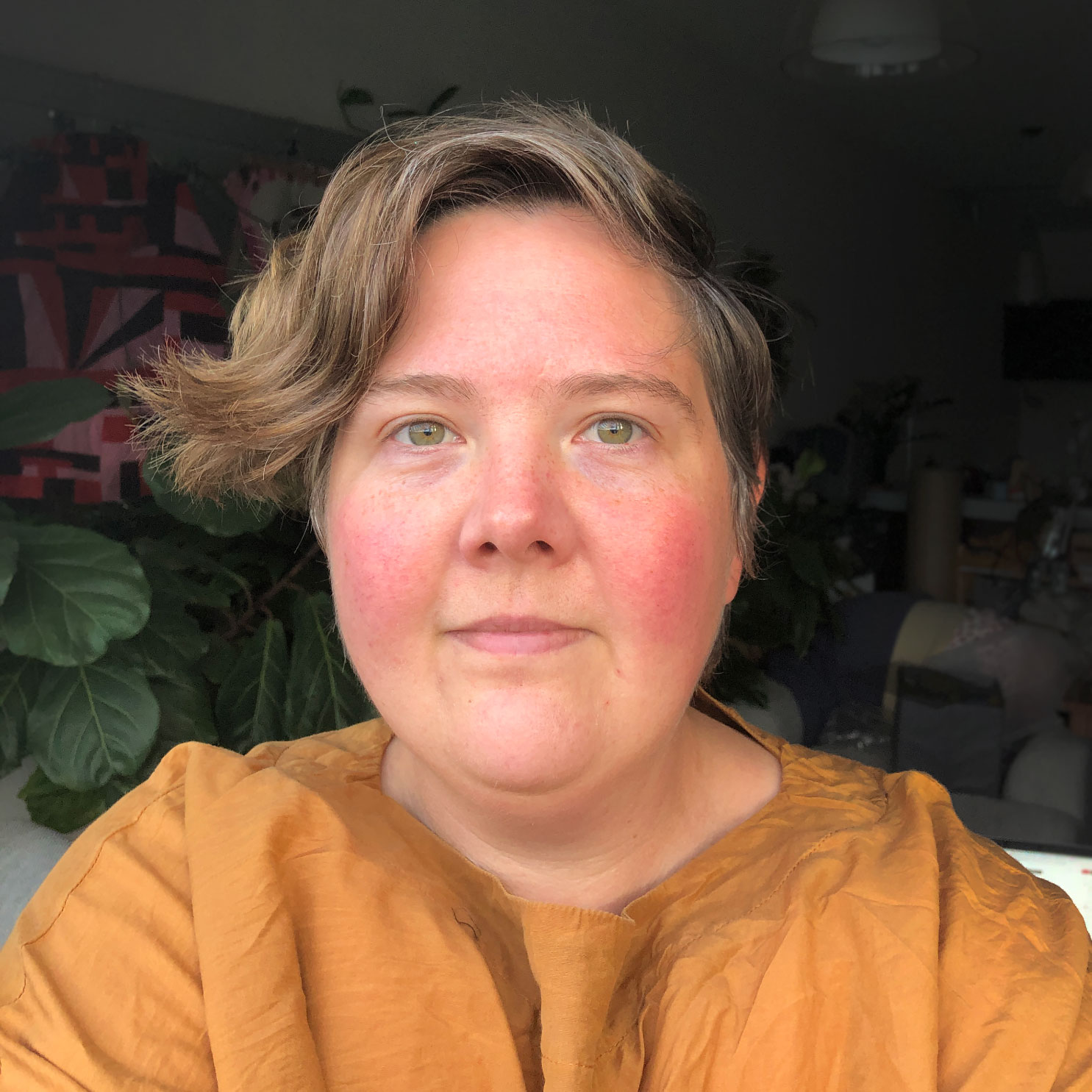
I see a really big difference between the two. Do you?

Interesting topic especially with the pictures you’ve used. I am very pale, blond with green eyes. I hate me in pastels. I just fade out completely. I prefer more contrast too.
LikeLike