I’ve been sharing a lot on the Muna and Broad Patreon about colour theory and colours in wardrobes, as I try to get myself to a point where I have a high hit rate with my makes. Cutting down on makes that don’t feel like a success, will save me lots of time, money and heartache. I’d love to work out what exactly it is that I love my most-worn garments, and why I don’t reach for others so I can feel confident that something will work well BEFORE I make it!
 //embedr.flickr.com/assets/client-code.js
Thinking about wardrobe success
Of course, wardrobe success isn’t just about colour- I’ve been thinking a lot about why some combinations work, why do I struggle to get dressed for fancy occasions, what makes a successful casual outfit.
I spotted this fabric fanciness matrix (TM) in the most recent email newsletter from @michelleofatime (sign up to her great monthly email newsletter here). I love Michelle’s approach to style and dressing, and I love that she’s documented an easy way to think about the inherent fanciness of a particular fabric. In her email Michelle outlined how deviation from the perceived fanciness of a particular fabric creates a tension which can make for a great outfit.
‘Wearing finished garments that have been made up in oppositional ways to the fabric’s given qualities give your outfits instant tension. Tension is that high/low, push/pull, je-ne-sais-quoi that turns your outfits into LOOKS and not just well-matching collections of separates.’
@michelleofatime
//www.instagram.com/embed.js
I love Michelle’s example of how making something tailored, with sharp design lines and contrasting it with the nubby, organic texture of silk noil. It can be hard sometimes to match sewing pattern and fabric into a pairing that works! For future projects, I’ll be thinking about where my project sits on the fabric fanciness matrix.
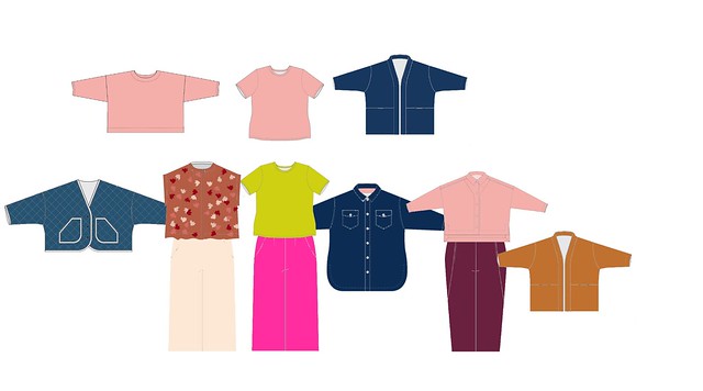
Colour Scheme 1st draft
Based on my most-worn pieces from my existing wardrobe, and colours that I love I came up with the above colour scheme, which is based on this wardrobe colour scheme blog from Anuschka Rees.
The bottom two big colours are the ‘wardrobe neutrals’, in my case denim and undyed linen. The 3 big colours are ‘main colours’, which are colours that make up most of your wardrobe (perhaps the anchor colours). All of the anchor colours have to work with each of the neutrals.
 //embedr.flickr.com/assets/client-code.js
The smaller colours on the right are ‘accent colours’, which should all work with each of the neutrals and at least two of the main/anchor colours. If they work with each other, then that’s a bonus too.
Although the colours that I’ve managed to put on the screen aren’t exact replications of the fabrics that exist in my wardrobe, my sewing table is currently covered in finished/much loved garments, scraps from previous projects, and whole pieces of fabric that have been earmarked for future projects.
Conclusion
I’m not sure that this will be my final colour scheme, but I can recognise all of the shades in here, and feel like it’s a pretty accurate representation of my current wardrobe. That doesn’t necessarily mean that it’s my dream colour scheme, or my only colour scheme. Perhaps this is my summer colour scheme, and I need to come up with a plan for a darker, winter colour combo?
Want more colour scheme/sewing info?
Check out the Colour Palettes – Crafting A Rainbow.

Thanks! Interesting to ponder. I always struggle with veering towards black even though I enjoy wearing color, and it certainly helps improve my attitude.
LikeLike
Looking at my colour season last year has finally brought me around to the fact that black does absolutely nothing for me, even though it’s supposed to be a shade that works for everyone. I had a hard time working out where to go to as my base colours after writing black off- it seems that full colour was the answer!
LikeLike
thanks for this. I tend to have a winter and a summer colour scheme. Must admit I base it around one main colour for each season. Usually black for winter and demin blue for summer. as I get older I feel straight black is too stark so am going more for dark grey. With 2 main colours I include shades and tints of those colours plus complementary and contrast colours. It makes dressing in the morning easier as most things mix and match.
The fabric fanciness matrix is where I have the most problem.
LikeLike